Road Accident Dashboard Excel: Building a Smarter Future for Road Safety🚦📊
👋 Welcome! Reimagining Accident Analytics
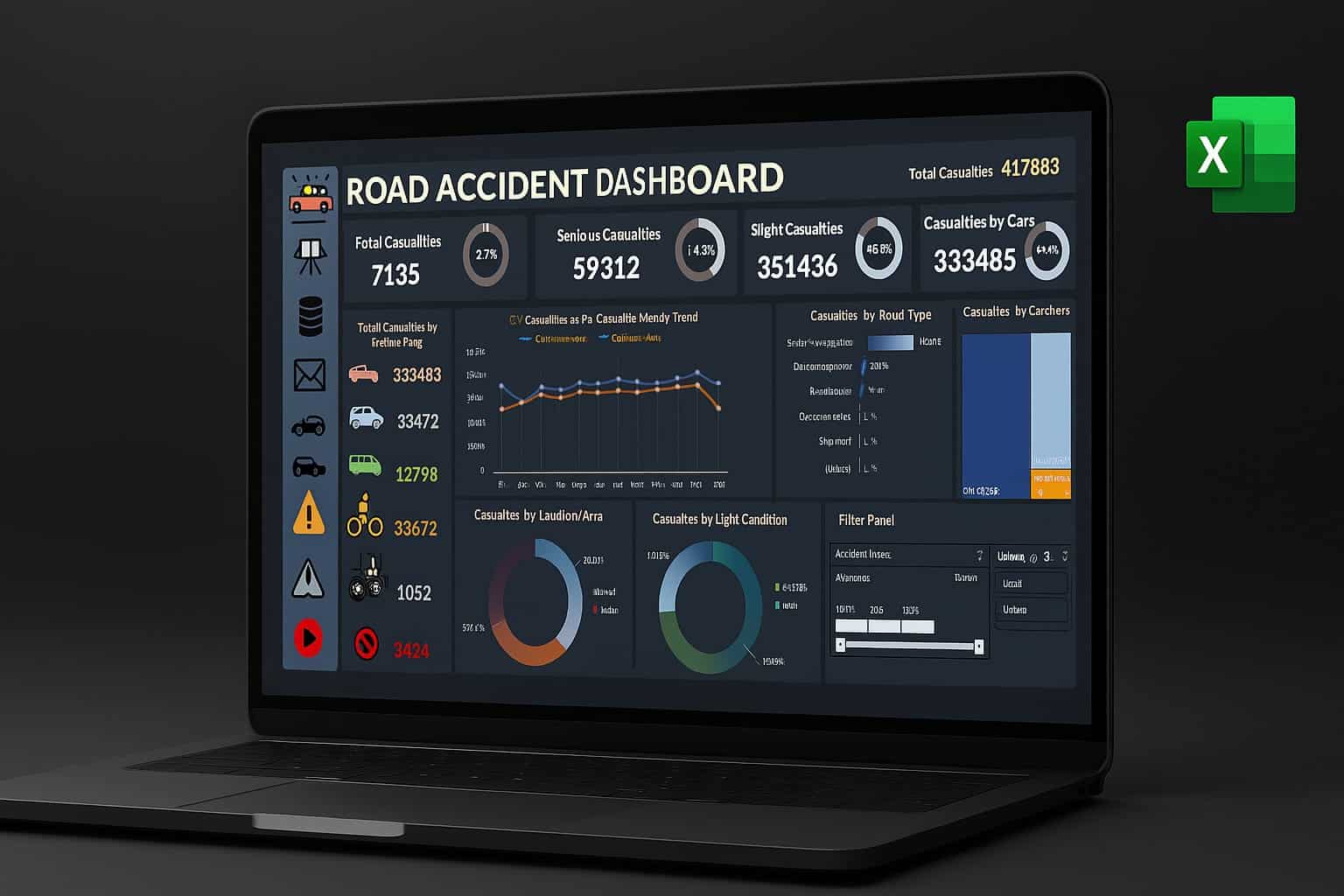
Hey there, fellow data explorer! Every number tells a story—and when it comes to road safety, those stories can save lives. I set out to transform not just spreadsheets, but real-world outcomes, with a dazzling, intuitive Excel dashboard made for fast learning, instant insights, and repeat visitor delight. Let’s take the tour:
Introduction
Road safety is more than just a statistic—behind every number is a life, a family, a community. For this project, I set out to build a Road Accident Dashboard Excel that transforms raw UK accident data (over 307,000 records from 2021–2022) into actionable insight for government, emergency services, and the public. Here’s my unique, step-by-step approach to turning dense spreadsheets into an interactive, visually engaging safety tool.
Step 1: Data Cleaning—The Foundation of Trust 🧹
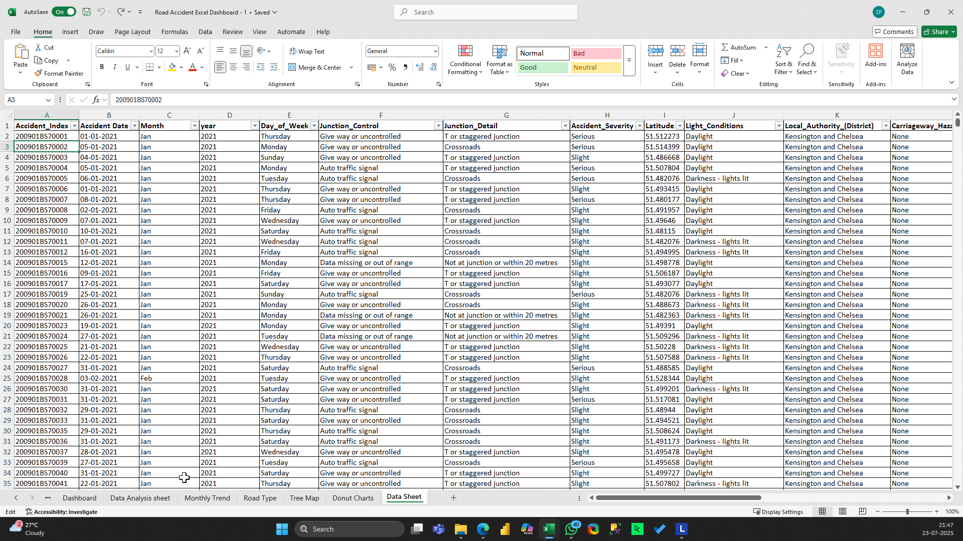
Before any analysis, data quality is paramount:
-
Outlier Detection: Used conditional formatting to identify extremes for casualties and severity.
-
Correcting Errors: Fixed typos such as “fetal” to “fatal” in accident severity.
-
Deduplication: Ensured “Accident_Index” had no blanks or duplicates.
Standardization: Harmonized categories across vehicle types and accident fields.
Step 2: Intelligent Data Processing—Unlocking Hidden Insights 🔍
- Transforming the data makes it analysis-ready:
- Created “Month” and “Year” fields using Excel functions (
=TEXT(date,"mmm"),=TEXT(date,"yyyy")). - Added attributes such as “Urban/Rural” and “Light Condition” for segmentation.
Step 3: KPI Calculation—Anchoring the Story with Core Metrics 📌
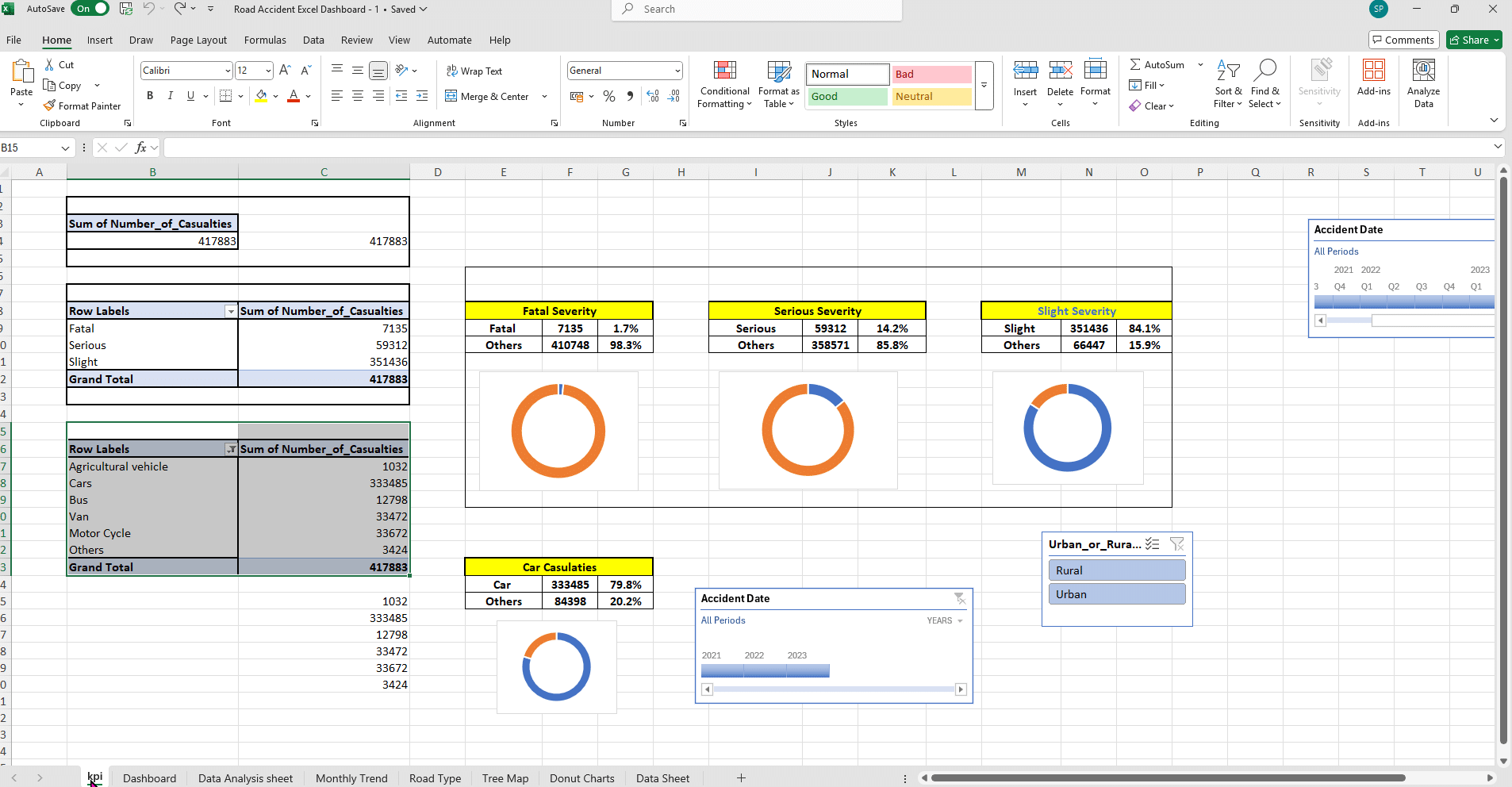
- The KPI Sheet distills complexity into clarity:
| KPI | Value |
|---|---|
| Total Casualties | 417,883 |
| Fatal Casualties (%) | 7,135 (1.7%) |
| Serious Casualties | 59,312 (14.2%) |
| Slight Casualties | 351,436 (84.1%) |
| By Cars (%) | 333,485 (79.8%) |
Step 4: Deep Analysis—From Trends to Causes 📈 Data Analysis
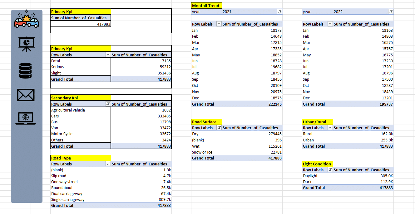
Created multiple focused pivot tables:
-
Vehicle Type (using custom calculated items like Car+Taxi)
-
Road Type rankings (Single carriageways highest, slip roads lowest)
-
Surface & Time Factors (Dry roads, wet, snow/ice; monthly breakdown)
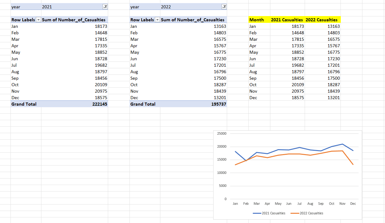
Monthly Trend
Charted dual lines for year-on-year trend analysis.
Step 5: Data Visualization—Making Insights Instantly Understandable 🎨
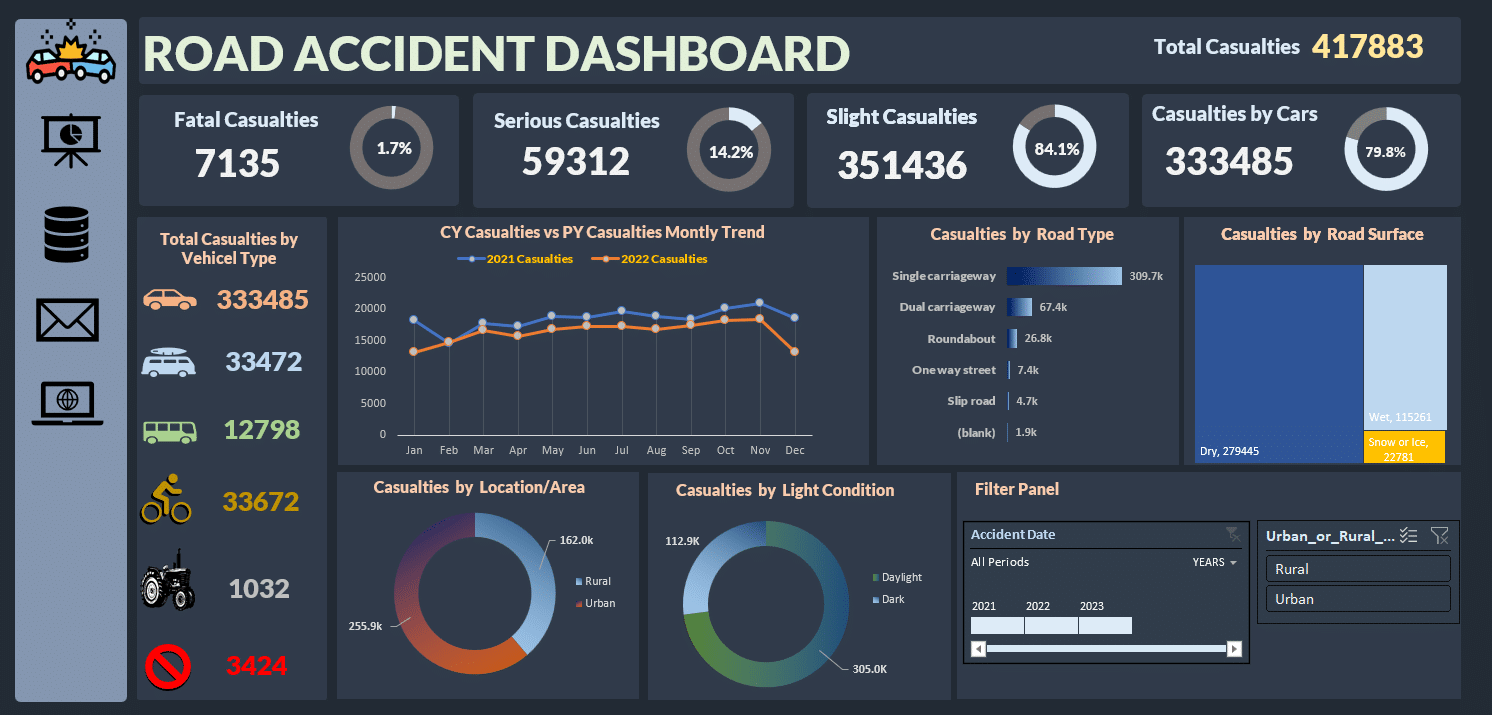
Dashboard Visuals
-
Headline KPIs (top-left)
-
Donut Charts: Severity (Fatal, Serious, Slight)
-
Combo Line Chart: Monthly Trends
-
Bar Chart: Road Type Analysis
- Tree Map: Road Surface Conditions (Dry, Wet, Snow/Ice)
Area and Light Condition Breakdown
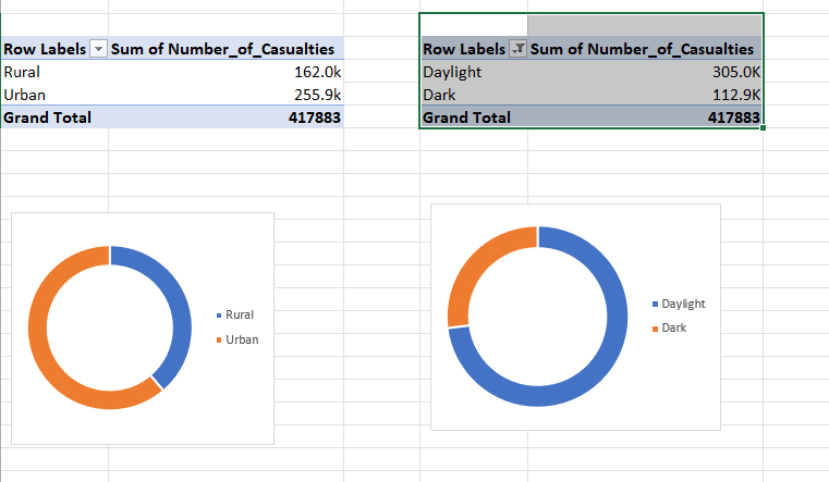
Urban/Rural segmentation
Daylight/Darkness accident analysis
Step 6: Creating Seamless User Experience & Navigation 🖱️
- Filter connections so all visuals update together.
- Icon-based navigation, hyperlinks to detail and raw data sheets.
-
Cars responsible for nearly 80% of all casualties.
-
Autumn months see higher accident rates.
-
Urban areas and daylight hours pose the most risk.
-
- Single carriageways need more interventions.External links for road safety resources, and email sharing options.
Key Insights Discovered by the Dashboard
- Focus campaigns for car drivers in high-risk periods and locations.
- Target urban road safety initiatives.
- Monitor impact using dashboard filters for instant scenario testing.
Final Thoughts
Building this Road Accident Dashboard Excel was about moving beyond raw tables—it was about turning data into clarity, and clarity into action. Thoughtful data cleaning, smart structuring, tailored visuals, and interactive design help transform not only information, but outcomes. Excel—when used this way—becomes a true vehicle for positive change.

